© 2026 Yasaman. All rights reserved.
Back to Projects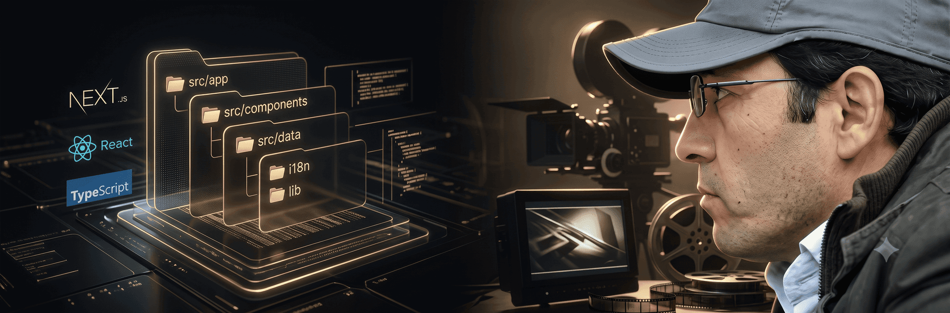
Sirous Ranjbar portfolio
Overview
CINEDEPT — Multilingual Cinematic Portfolio Website
CINEDEPT is a modern cinematic portfolio platform designed to showcase the creative work, professional journey, and artistic achievements of a filmmaker. The goal of this project was to create a premium digital experience that reflects the visual identity of a creative professional while providing a fast, accessible, and scalable platform for presenting films, projects, awards, press coverage, and personal storytelling.
Unlike a traditional portfolio website, this project was built as a structured content-driven platform where every section is designed around storytelling. The website needed to support a large amount of structured content, including film collections, detailed filmography, gallery archives, festival awards, media coverage, books, and future projects. The architecture was designed to make content management easier while maintaining a clean separation between data, presentation, and application logic.
Project Goals
The main objective was to build a visually immersive website that could represent the cinematic nature of the filmmaker’s work while maintaining excellent performance and usability across different devices.
The key goals included:
Creating a premium and minimal visual experience focused on storytelling
Building a scalable architecture for future content expansion
Supporting multiple languages for an international audience
Providing full RTL support for Persian users
Improving discoverability through SEO-friendly implementation
Ensuring accessibility and usability standards
Delivering a fast and optimized experience despite heavy visual content
Technical Architecture
The website was developed using Next.js App Router, React, and TypeScript, following modern frontend architecture principles.
The application uses a component-driven structure where UI components are responsible only for presentation, while all content and business data are managed through strongly typed data models. This approach creates a maintainable system where adding new films, awards, gallery items, or press content does not require modifying the UI components.
A clear separation between content and presentation was implemented:
Data models define the structure of films, awards, press items, books, and projects.
Components receive localized content and render reusable interfaces.
Translation dictionaries handle interface text across all supported languages.
SEO utilities generate consistent metadata and structured information.
This architecture makes the platform easier to maintain, extend, and hand over to future developers.
Multilingual and Internationalization System
One of the important challenges of this project was supporting a global audience with different languages and writing directions.
The website supports four languages:
English
German
French
Persian
A custom internationalization system was implemented with localized routing, language detection, translation dictionaries, and direction management.
The application automatically handles:
Language-based URL structures
Localized metadata
Search engine language alternatives
Right-to-left layout support for Persian
Dynamic HTML language and direction attributes
The RTL implementation was built using logical CSS properties instead of separate stylesheets. This allows the same components to work naturally in both left-to-right and right-to-left environments.
User Experience and Visual Design
Because the website represents a filmmaker and creative professional, visual storytelling was a major priority.
The interface was designed around cinematic principles:
Large visual sections
Immersive hero presentation
Elegant typography
Smooth transitions
Minimal interface elements
Strong focus on photography and film materials
Interactive sections such as film carousels, galleries, and project showcases were designed to create an engaging browsing experience without compromising performance.
Motion effects were implemented carefully using Framer Motion, with accessibility in mind. Users who prefer reduced motion receive a simplified experience while maintaining full functionality.
Performance Optimization
Performance was a key consideration because the website relies heavily on visual media.
Several optimization strategies were implemented:
Static page generation for fast loading
Next.js image optimization
Responsive image handling
Modern image formats
Lazy loading for below-the-fold content
Optimized media delivery
Reduced JavaScript execution where possible
The application follows a server-component-first approach, using client-side rendering only when required for interactive features such as galleries, filters, forms, and animations.
SEO and Search Optimization
The project includes a complete SEO foundation designed to improve visibility and search engine understanding.
Implemented features include:
Dynamic metadata generation
Sitemap generation
Robots configuration
Canonical URLs
Hreflang language alternatives
Structured data using JSON-LD
The website provides search engines with clear information about the filmmaker, creative works, films, and professional presence.
Accessibility Considerations
Accessibility was treated as a core part of the development process.
The project includes:
Semantic HTML structure
Keyboard navigation support
Accessible interactive components
Proper ARIA attributes
Screen-reader-friendly content
Focus management in modal interfaces
Reduced motion support
Components such as galleries, carousels, language selectors, and contact forms were developed with accessibility requirements in mind.
Main Features
The website includes multiple dedicated sections:
Film Portfolio
A dedicated film section allows visitors to explore featured works through cinematic presentations, posters, trailers, and detailed descriptions.
Filmography
A structured filmography page presents professional credits with filtering capabilities, making it easier for visitors to explore different categories of work.
Awards and Achievements
A timeline-based awards section highlights festival participation and professional recognition.
Gallery Experience
A responsive gallery system provides an immersive way to explore behind-the-scenes photography and visual archives with modal viewing functionality.
Press and Media Coverage
A dedicated press section presents external publications, mentions, and professional references.
Contact System
A secure contact form was implemented with validation, accessibility considerations, and server-side handling.
Development Approach
The project was developed with a focus on clean code, scalability, and long-term maintainability.
Key engineering decisions included:
Reusable component architecture
Strong TypeScript typing
Data-driven content management
Modern Next.js conventions
Minimal dependency usage
Clear project organization
Production-focused optimization
The final result is a scalable digital platform that combines cinematic design with modern frontend engineering practices, providing an elegant online presence for a creative professional while maintaining the technical foundation required for future growth.
Sirous Ranjbar portfolio
A multilingual cinematic portfolio website built for a filmmaker, featuring filmography, awards, press coverage, galleries, and storytelling-driven content with a focus on performance, accessibility, and SEO.
Technologies Used
Next.jsTailwind CSSSEOTypescripteccommerce